The Science Behind Color Psychology

Colors have a profound influence on our mood, emotions, and even behavior. As we step into 2026, the emphasis on mental well-being has never been stronger, and the palette of our homes can play a pivotal role in fostering a serene and happy environment. But how exactly does this work? The science of color psychology delves into the impact of various hues on the human psyche. For instance, blues and greens are often linked to calmness and relaxation, making them ideal for bedrooms and living spaces where you unwind.
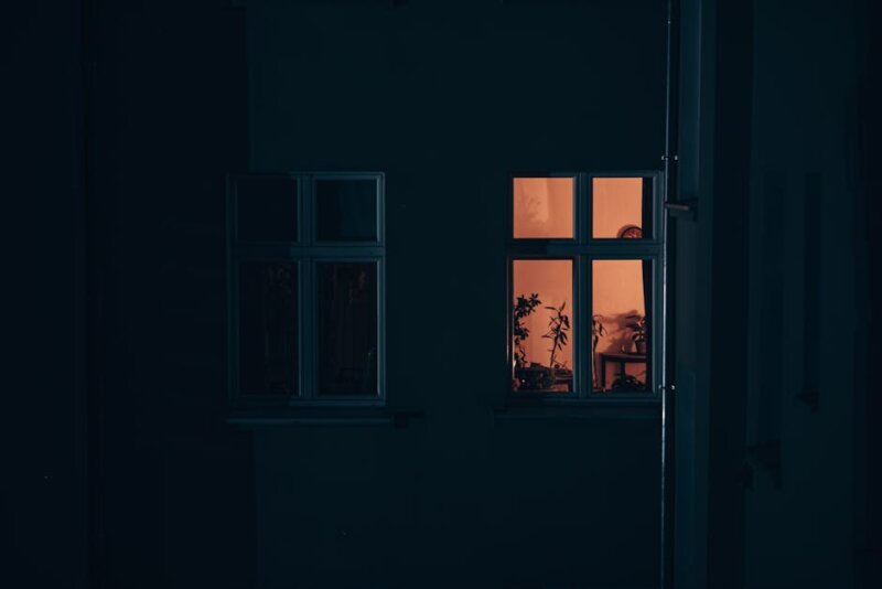
Adopting Tranquil Blues for Restful Retreats
Imagine stepping into a bedroom awash with shades of azure and cerulean. These colors mimic the sky and ocean, inherently soothing elements of nature. In 2026, the trend of using deep blues in bedrooms continues to rise. Not only do they promote restful sleep but they also create a luxurious and intimate atmosphere. Consider accenting with gold or cream to add warmth and elegance to your blue haven.
Energize Your Spaces with Dynamic Reds and Yellows
While some colors calm, others invigorate. Reds and yellows are vibrant, energetic colors that can uplift the mood of a space. These hues are perfect for areas where activity and creativity are encouraged, such as home offices or kitchens. However, it’s important to strike a balance. A bold red wall in a kitchen can stimulate conversation and appetite, while pops of yellow in an office setting can spark creativity and innovation. Try pairing these with neutrals to avoid overwhelming the room.
Nurturing Green: Bringing Nature Inside

The biophilic design trend, which focuses on bringing nature indoors, is elegantly complemented by the color green. This hue, synonymous with growth and renewal, is perfect for any space in your home. In 2026, olive and sage greens are particularly popular, offering a muted, sophisticated touch that blends seamlessly with wood and metal accents. Consider using green in spaces where you need a mental refresh, like reading nooks or meditation areas.
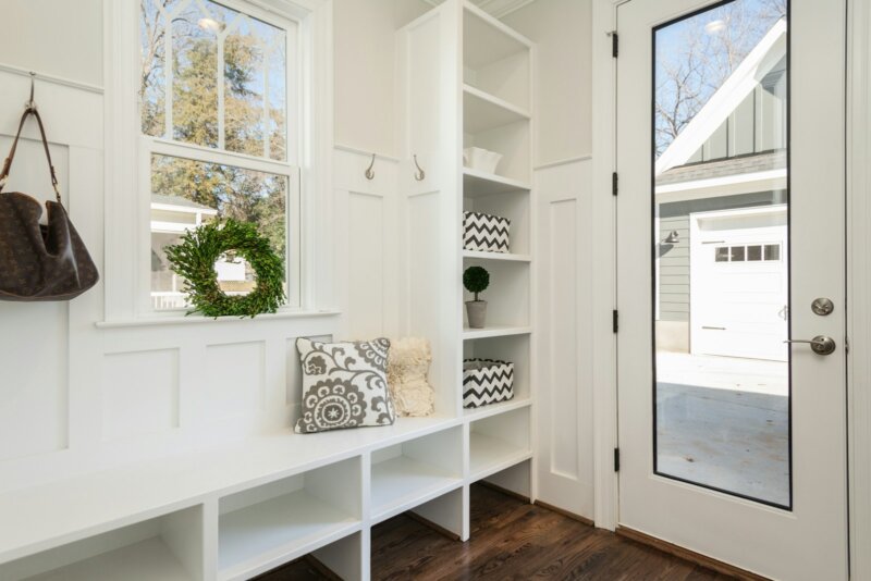
Calm and Collected: Embrace Neutrals
In the hustle and bustle of modern life, sometimes neutrality is key. Shades like taupe, beige, and soft grays provide a calming backdrop that allows other colors and furnishings to shine. These timeless hues offer flexibility and are perfect for open-plan living spaces. They act as a blank canvas, allowing you to switch accents and decor elements with ease as your tastes evolve.
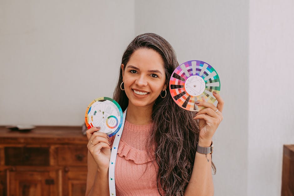
Creating a Harmonious Palette: Tips for Homeowners
Creating a harmonious color palette for your home doesn’t require a design degree. Start with a base color that resonates with you and build from there. Use color wheels to find complementary or analogous colors, and don’t be afraid to experiment with different combinations. Remember, your home is your sanctuary. It should reflect your personal style and foster a sense of well-being. For those looking for guidance, many interior design apps available in 2026 offer virtual try-ons for wall colors, making it easier than ever to visualize changes before committing.
Whether you’re looking to revamp a single room or your entire home, understanding the power of color psychology can transform your space into a refuge that supports your lifestyle and enhances your well-being.

Practical Takeaway: Dive into the world of color psychology and explore how subtle changes can make a big impact on your home’s atmosphere. Remember, the right colors can turn your home into a true haven of comfort and positivity.