Home should feel steady, not tense. Color psychology shows that calming palettes can shift mood, ease stress, and support wellbeing. Here are Calming Color Palettes Backed by Psychology, plus simple interior design steps that work in real rooms.
You will see how color affects emotion, attention, and daily habits. Small changes add up, and the right hue can make rest feel easier.
The Psychology of Calming Colors
Colors shape more than style, they guide emotion and behavior. Calming hues can support relaxation, focus, and a sense of safety. That is why designers pair science with aesthetics in most soothing spaces.

How colors impact emotions and mood
Colors can nudge choices and set the tone of a space. Warm hues like red, orange, and yellow spark energy. They may feel cheerful or tense, based on context. Cool hues like blue, green, and purple tend to quiet the mind, yet for some people they can feel distant.
Research links color to real body changes. Red can raise blood pressure and speed reaction time in sports. In pill studies, red placebos felt more energizing; white placebos felt better for pain relief. Therapist Dr. Rachel Goldman notes that a fresh wall color can shift mood quickly.
Clothing and uniforms matter too. Black sports uniforms have been linked with more penalties, likely due to perception. Shoppers also judge products by color. A friendly hue can draw the eye and boost interest.
One study found students who saw red before a test scored over 20 percent lower than those who saw calm greens or blacks. Color exposure, even for a moment, can affect performance and confidence.
The connection between color and relaxation
Soft colors help the brain downshift. Blues and greens often lower stress and support a steady heart rate. Some people use chromotherapy, a light-based color method, to support relaxation and healing. Ancient Egyptian and Chinese practices used similar ideas for health.
Recent studies offer helpful clues. In 2020, ICU nurses who tried chromotherapy reported less compassion fatigue and fewer PTSD symptoms. Muted pastels tended to feel more soothing than bright tones.
Effects vary by person. A blue room may calm one person yet feel cool to another. Results also fade if exposure is constant. Color is a helpful tool, not a cure. That said, a well-chosen palette can create a stable baseline for rest.
Each calming shade brings a distinct mental effect. Next, explore key hues and how they can support daily life.
Key Calming Colors and Their Psychological Effects
Thoughtful color choice can soften stress and support mood enhancement. These soothing hues work in homes, clinics, and offices with strong results.

Blue: Serenity and mental clarity
Blue signals serenity and steadiness. Many people report less anxiety in blue spaces. Studies link blue to lower blood pressure and better focus. Brands also use blue to show trust and reliability.
In a 2020 survey, 35 percent of people connected blue with relief. Therapy rooms and healthcare offices often use soft blues for that reason. People who prefer blue often value care and order in their environment.
Try Blue 15 Matt. It is a balanced sky blue with gentle yellow or gray notes. It supports calm thinking at home or work.
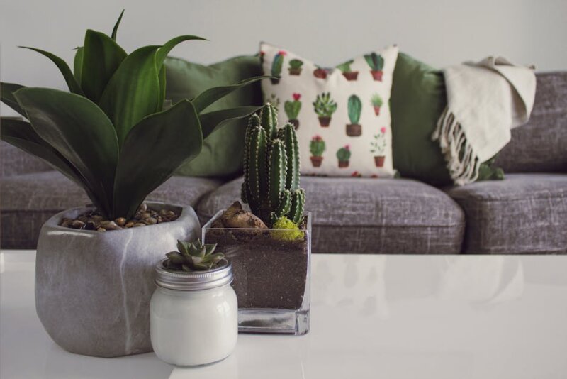
Green: Balance and tranquility
Green suggests balance, growth, and harmony with nature. It often feels restful to the eyes. In 2020, 39 percent of surveyed people reported contentment when viewing green. The color also supports mental health awareness, signaling hope and care.
Soft sages, like Green 02 Matt, lean calming with blue or gray undertones. Green 09 Matt brings uplifting yellow or gray notes. Even green building facades can boost mood and body health in some studies.
Bedrooms, living rooms, and study spaces often benefit from green. The tone supports steady attention without strain.
Pink: Comfort and warmth
Pink blends red, which signals energy, with white, which signals purity. Together they feel caring and gentle. In 1979, a prison used pink walls and saw lower aggressive behavior among inmates.
Designers often choose blush pink to soften nerves. A dental clinic, for example, might add blush armchairs to ease anxiety. In a 2020 survey, half of participants linked pink with love.
For a quiet touch, try Pink 07 Matt. It brings comfort without visual noise, which helps reduce stress.
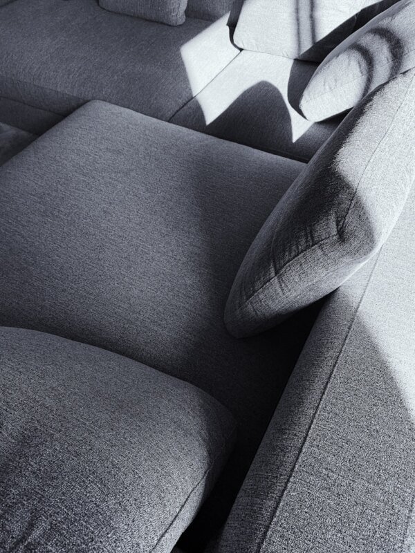
Neutral tones: Spaciousness and simplicity

Neutrals like white, beige, and gray create a clean canvas. They increase the feeling of space and reduce visual clutter. Many people choose neutrals for calm and minimal style.
White 06 Matt adds comfort with subtle pink undertones. Beige 03 Matt feels grounding with gentle gray or yellow notes. In a 2020 survey, 43 percent of people felt relief when viewing white shades.
Earthy neutrals are trending because they feel warm and human. Neutrals also mix well with accents, so personality still shows while calmness stays intact.
How to Use Calming Colors in Your Space
You can apply these ideas in small steps. Start with a room that needs rest and focus most.
Best rooms for incorporating calming colors
Bedrooms benefit most from soft blues, pale greens, and gentle neutrals. These hues signal night and rest. Avoid strong reds or bright oranges. They can interrupt calm sleep.

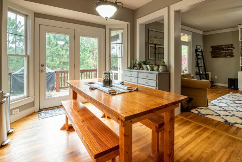
Living rooms often work well with greens or balanced blues. These shades support harmony for family time and guests. Therapy offices and healthcare rooms also use cool tones to reduce stress and support safety.
Create meditation corners or reading nooks with muted palettes. A small chair, a lamp, and a soft throw can make a steady retreat.
Pairing calming tones with complementary accents
Start with a neutral base to keep peace. Then layer calm hues for depth.
- Use soft beiges or warm grays on large walls.
- Add light blues or sage greens for harmony and flow.
- Bring in texture with knits, linen, or natural wood.
- Test paint samples in daylight and at night before you commit.
For contrast, pair light walls with darker accents. Blue with a touch of orange feels lively without chaos. Green with muted red reads rich and classic. A monochromatic scheme, one color in many shades, looks clean and quiet.

Keep brights limited to small items like pillows, trays, or art. Muted tones support relaxation better, based on color theory and many mood studies.
Bottom Line
Calming Color Palettes Backed by Psychology can shape daily life in simple ways. Blues, greens, soft pinks, and grounded neutrals bring serenity and mood enhancement. These choices support wellbeing at home and in workspaces.

Color is one helpful tool, not medical care. If anxiety or low mood persists, seek a licensed professional. For interior design decisions, start small and observe your emotional response. With steady testing and a clear eye, a calm environment is within reach.